
How to Reduce Subscription Churn With Smart Cancellation Flows
Summary
Key Stat: Up to 40% of subscription cancellations can be reversed by presenting the right offer at the right time.
Key Learning: The most effective cancellation flows ask users why they're leaving and present a dynamic offer, like a discount for price sensitivity or a pause for low usage.
Key Action: A native, in-app cancellation experience is crucial for trust; web redirects feel jarring and undermine your retention efforts.
The Solution: Implement a native, smart cancellation flow in minutes with the Allocents SDK to A/B test offers and recover churn without rebuilding your billing stack.
Churn often creeps up silently. One month your numbers look solid, the next you're staring at a dip wondering what happened. And the worst part? As one developer described it on Reddit, "customers cancel without ever telling you why."
That silence is costing you real money. But what if the moment a user taps "Cancel" was actually your best opportunity to keep them?
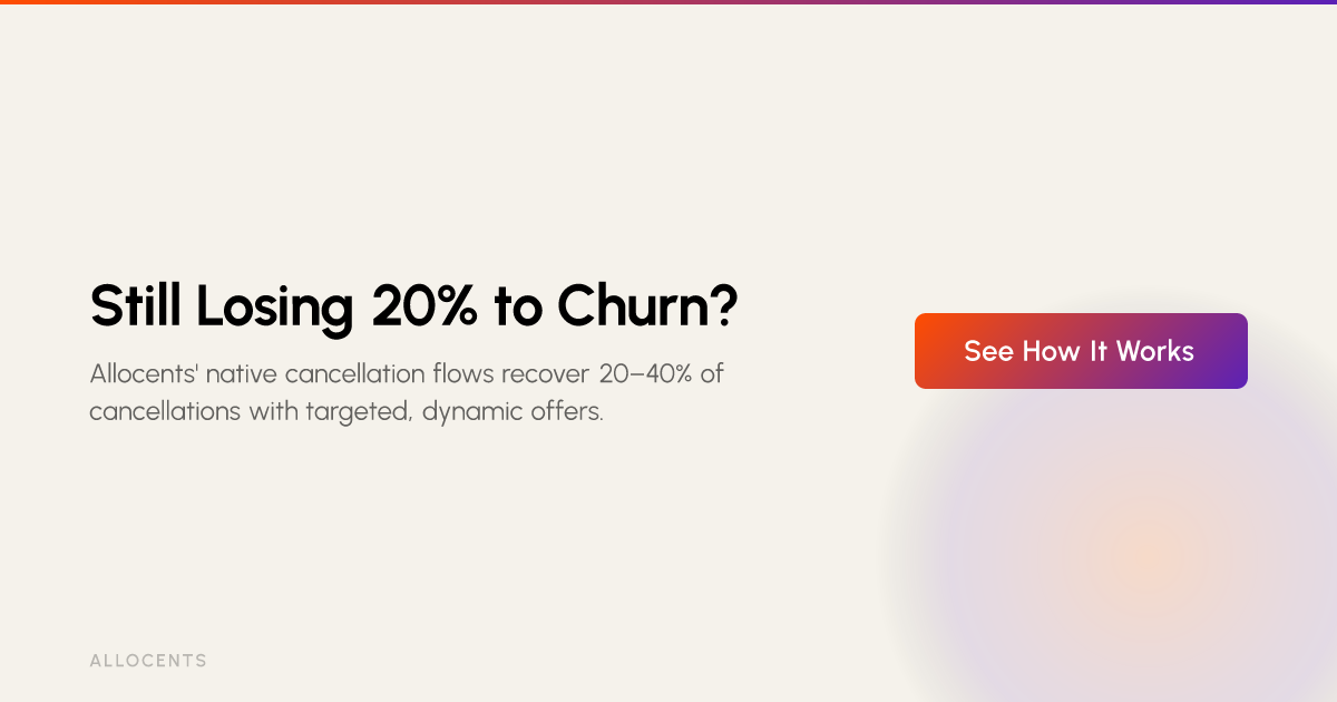
Most apps treat cancellation like a formality: click "Cancel" → "Are you sure?" → Done. Customer gone forever. It's a massive missed opportunity — because according to conversion experts at FunnelFox, 20–40% of cancellations can be reversed with the right offer presented at the right time. That's not a rounding error. For an app doing $1M ARR, that's potentially $200K–$400K in recoverable revenue sitting behind a better cancellation screen.
This guide breaks down exactly how to reduce subscription churn using a high-converting cancellation flow — covering offer timing, pause mechanics, copy framing, and how to implement it natively without rebuilding your billing stack.
The Two Faces of Churn (And Why They Need Different Fixes)
Before you can plug the leak, you need to know where it's coming from. Stripe defines two distinct types:
Voluntary Churn: The Active Decision to Leave
This is when a user consciously decides to cancel. The triggers are usually one of a few things:
Price anxiety. Customers face mounting anxiety over monthly charges and start auditing their subscriptions. As one Reddit commenter put it: "If churn after month 2 is high, it usually means they didn't see enough value in the product during that window to justify committing further."
Subscription fatigue. The subscription just fades into background noise, unused.
A better alternative. A competitor offered something more relevant, cheaper, or both.
Feeling trapped. This one's subtle but destructive. The moment a subscription feels like a trap — a confusing cancel flow, buried settings, fake urgency — you lose them emotionally before you lose them contractually. As one user bluntly stated: "the moment it feels like a trap, you lose them."
Voluntary churn is the type that smart cancellation flows are specifically designed to intercept.
Involuntary Churn: The Silent Revenue Drain
Involuntary churn happens when a subscription lapses not because the user wanted to leave, but because their payment failed — expired card, insufficient funds, bank block. This is shockingly common. According to one community analysis, 10–20% of all subscription SaaS churn is just failed payments or expired cards.
The fix here is different: smart dunning sequences, multiple payment method support, and proactive card expiry notifications. But the foundational fix is having a billing infrastructure that handles retries gracefully — which we'll come back to.
Anatomy of a High-Converting Smart Cancellation Flow
The goal isn't to make cancellation hard. It's to make staying compelling. Here's what a genuinely high-converting flow looks like in practice:
Step 1: Make Cancellation Easy to Find
Counter-intuitive but essential. Burying the cancel button in a labyrinth of settings menus doesn't prevent churn — it creates resentment. The best apps place it exactly where users expect it: Settings → Account → Manage Subscription. FunnelFox's research confirms that accessible cancellation flows paradoxically improve trust and long-term retention.
Step 2: Ask Why With a One-Tap Exit Survey
Before confirming anything, ask a single, clear question. Something like:
"What's the main reason you're leaving?"
It's too expensive
I'm not using it enough right now
I found a better alternative
I'm missing a key feature
Technical issues
This isn't just product research — it's the decision engine for your next step. The cancellation flow is a goldmine of insights that most founders leave untapped. According to Apptweak's retention research, capturing this signal in real-time is one of the highest-leverage things a subscription app can do to improve both retention and product development.
Step 3: Make a Targeted, Dynamic Offer
This is where the magic happens. Based on the user's answer, surface a relevant offer on the next screen — not a generic pop-up, but a response that shows you heard them.
If they said "Too expensive":
"We don't want to lose you. How about 50% off for the next 3 months?"
Headspace does this well — users who flag cost as a reason to leave are met with a meaningful discount offer rather than a simple confirmation screen. The offer intercepts the decision at its most rational moment.
If they said "Not using it enough":
"Need a break? Pause your subscription for 1, 2, or 3 months — free. Your data and progress will be here when you're back."
The pause option is underused and highly effective. Research on cancel flows shows that pause offers resonate particularly well with users who cite lifecycle reasons (injury, busy season, travel) rather than product dissatisfaction. Churn can be significantly alleviated by giving customers greater flexibility — and a pause is the most flexible offer you can make.
If they said "Found a better alternative":
"Before you go — here's what you'd lose: [Feature 1], [Feature 2], and [Upcoming Feature launching next month]."
This is a value reminder, not a guilt trip. Show them what they built with you, not just what you're charging them for.
Step 4: Nail the Copy Framing
The tone of your cancellation flow matters as much as the offer itself. A few principles that separate high-converting flows from forgettable ones:
Empathy over urgency. Skip the countdown timers and guilt-laden copy. "We'll miss you!" feels hollow. "Keep your momentum with this exclusive offer" is benefit-first.
Acknowledge their reason. If they said they're not using it enough, don't pitch a discount — pitch flexibility. Mirror their language.
Strava does this well. Rather than fighting the cancellation, they reframe it as an upgrade opportunity — surfacing an annual plan at a lower effective monthly rate right at the moment of exit intent.
The Native Advantage: In-App Flows vs. Web Redirects
Here's where most developer teams fall short in execution — not in strategy, but in implementation. Building these dynamic, multi-step flows is genuinely complex:
Discount logic tied to survey responses
Pause mechanics that sync with your billing system
A/B testing different offer amounts and copy variants
Doing all of this without shipping a new app version every time you want to tweak a headline
The common workaround? Patching with 3+ tools — a Stripe integration here, a third-party churn tool there, a web view redirect to handle the actual cancellation flow. The result is a jarring, non-native experience that makes users feel like they've been handed off to some back-office system. It erodes the exact trust you're trying to build.
Enter Allocents' Smart Cancellation Flows
Allocents is a direct billing SDK built by two ex-Apple software engineers — the kind of people who understand StoreKit from the inside out. As part of their full direct billing platform (unlocked by the April 2025 Epic v. Apple ruling), they've built native smart cancellation flows that implement exactly the strategy outlined above.
What makes it different:
It's genuinely native. The UI renders natively in Swift/SwiftUI, Kotlin, Flutter, and React Native. No web redirects, no Chrome Custom Tabs, no moment where the user feels handed off. The flow looks and feels like a first-party part of your app — because it is.
A/B testing is built in. Want to test a 30% discount vs. 50%? A 1-month pause vs. 3 months? Different headline copy? Allocents' dashboard lets you run these experiments and measure recovery rates by cohort — without writing new code or waiting for an App Store review cycle. Most teams that try to reduce subscription churn are guessing at what offer converts best. Allocents lets you know.
You configure from a dashboard. Survey questions, offer conditions, discount percentages, pause durations — all configurable without a code deployment. Your growth team can iterate on offers in real time.
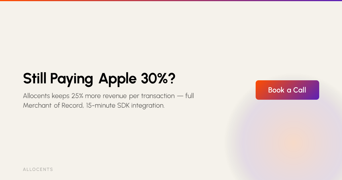
It integrates in 15 minutes. This is the headline differentiator. There's no need to rebuild your billing stack or rip out StoreKit. Allocents syncs automatically with your existing App Store Connect products and supports a gradual rollout — start with 10% of users, validate recovery rates, then scale.
The smart cancellation flows are part of Allocents' broader direct billing suite, which includes Sign Up & Save paywalls, Switch & Save migration campaigns for existing subscribers, and native checkout with Apple Pay and Google Pay — all operating at 5% + 50¢ per transaction (full Merchant of Record) or 0.5% through their Bring Your Own Stripe option for teams with existing Stripe infrastructure.
How This Plays Out by App Category
The principles above apply universally — but the specific offers that convert vary by context:
Fitness Apps (Fitbod, Strava): A user cancelling mid-January after a gym injury doesn't hate your app — they just need a break. The winning offer: "Pause for up to 3 months. Your workout history and personalized plan will be here when you're ready." That's not retention through persuasion; it's retention through actually solving their problem.
Dating Apps (Hinge, Bumble): Someone cancelling because they "met someone" is a win for them — and potentially a future re-subscriber. Acknowledge it warmly: "That's amazing! If you ever find yourself back in the game, your profile and matches will be waiting." A pause here isn't just functional — it's emotionally resonant.
Productivity Apps (Notion, Todoist): Cost anxiety is the dominant cancel trigger here. Ground your discount offer in something concrete: "You've completed 340 tasks and organized 12 projects with us. To keep that momentum going, here's 40% off for the next 6 months." Tying the offer to their actual usage history makes it feel earned, not desperate.
Stop Letting Revenue Slip Through the Cracks
Churn isn't just a cost of doing business — it's a solvable problem that most app teams are leaving unaddressed. By replacing a two-tap cancellation confirmation with a smart, empathetic, data-driven flow, you can realistically recover 20–40% of customers who would otherwise be gone forever.
The formula is simple: make cancellation easy to find, ask why they're leaving, surface a relevant offer in response, and do it all in a native experience that doesn't break the trust you've already built.
If you want to skip the 3-tool patchwork and implement this entire strategy in a single afternoon, Allocents' smart cancellation flows are the fastest path from "Are you sure?" to "Actually, I'll stay."
Start your 15-minute integration with Allocents →
Frequently Asked Questions
What is a smart cancellation flow?
A smart cancellation flow is an in-app process that intercepts a user's decision to cancel a subscription by first asking for their reason and then presenting a targeted offer, like a discount or a pause, to persuade them to stay. Unlike a standard "Are you sure?" confirmation, a smart flow uses the customer's feedback in real-time to provide a relevant solution. For example, if a user cites cost as the reason, the flow can automatically offer a temporary discount, turning the point of exit into an opportunity for retention.
Why is a smart cancellation flow effective at reducing churn?
A smart cancellation flow is effective because it directly addresses the specific reason a customer is leaving at the exact moment they decide to cancel, which can recover 20-40% of voluntary churn. Instead of losing customers silently, this process opens a dialogue. By offering solutions like pausing a subscription for those not using the app enough or providing a discount to price-sensitive users, it solves the customer's immediate problem and preserves the relationship, turning a potential loss into retained revenue.
What are the most common reasons for voluntary churn?
The most common reasons for voluntary churn include price sensitivity, subscription fatigue (not using the service enough), finding a better alternative, or feeling trapped by a confusing cancellation process. Understanding these triggers is crucial. Price anxiety leads users to audit their expenses, while subscription fatigue happens when the service becomes unused background noise. A smart cancellation flow is designed to identify and counter these specific issues.
Should I make my cancellation button hard to find?
No, you should never make the cancellation button hard to find. Hiding it creates user frustration and damages trust, which can lead to negative reviews and prevent them from ever returning. Best practices show that an easily accessible cancellation process, typically located under Settings > Account > Manage Subscription, paradoxically improves long-term retention. A transparent process builds trust, making users more likely to reconsider their decision when presented with a relevant offer.
What is the best offer to show a user who wants to cancel?
The best offer depends entirely on why the user is canceling. A dynamic flow should present a tailored offer: a discount for price issues, a subscription pause for low usage, or a value reminder for those considering a competitor. For a user who finds the service "too expensive," a 50% discount for three months can be highly effective. For someone "not using it enough," offering to pause the subscription for 1-3 months is often the better choice. There is no one-size-fits-all offer; the key is to listen to the user's feedback and respond accordingly.
What is the difference between a native cancellation flow and a web redirect?
A native cancellation flow is built directly into the app's interface for a seamless experience, while a web redirect sends the user out of the app to a web page to complete the cancellation. Native flows feel like a natural part of the app, maintaining user trust and context. They are faster and more reliable. In contrast, web redirects can feel jarring and untrustworthy, as if the user is being handed off to a separate system. This friction can undermine the effectiveness of your retention offers.